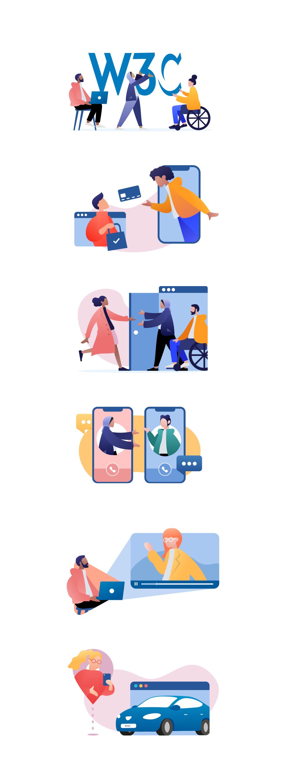
How we are using illustrations to represent the W3C
Updates Design Content
Our aim, and part of our brief, is to ensure that there is affordable scalability for site imagery. This means the visual style should be relevant to the audience, whilst offering flexibility so it can evolve and expand without large time or financial overheads required.
W3C subject matters are often complex and require careful thought when visualising them. Relying on stock imagery or photography runs the risk of miscommunication, or distracting users from the main content. For W3C, choosing a bespoke illustration-led approach proved to be the better option. The site redesign focusses on removing unnecessary written content and visual noise. It was important that the illustrations reflect this design philosophy. The streamlined content and improved user experience, along with relevant and concise visuals, aims to:
-
convey confidence in the W3C’s work
-
give clarity to people using the site.
Conveying a sense of community
The W3C community is diverse – a global coming together of people and organisations. It’s a trusted place of collaboration, resources and learning. The visuals need to portray an approachable and diverse community of like-minded people, spanning all races, genders and abilities. Our goal was to strike a balance between visually communicating the site’s authoritative content while properly representing the worldwide communities which benefit from the W3C’s standards.
Using Blush
Creating Illustrations can be time consuming and costly. There is no avoiding it, but there are ways we can minimise the impact it has on our processes.
The Sketch plugin, Blush was integral to establishing the style of our illustrations while retaining scalable affordability. As Sketch puts it, Blush allows you to ‘easily create and customise stunning illustrations right on your canvas. Iterate until you find the right image to tell your story.’
Blush provides designers with collections of customisable characters, whose features and poses can be swapped out on the fly. After an initial review and testing phase, we based our illustration style on the ‘Humaaans’ collection by Pablo Stanley. Using this collection as a starting point cut down design overheads and gave us time to expand the illustrations, adjust the look-and-feel and devote more attention to visual storytelling. The result? A suite of illustrations which covers complex subject matters and diverse characters in a vibrant, inclusive and concise package.
We’re currently creating the core illustrations with the help of Kenzo Ishida, a graphic designer volunteering for the W3C. We are looking forward to finalising the W3C illustration toolkit, which will enable any designer to pick up and create custom W3C illustrations in a cost and time-efficient manner.
Take a look at some of our work:
